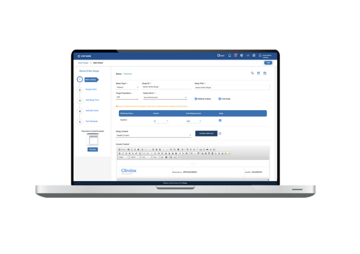
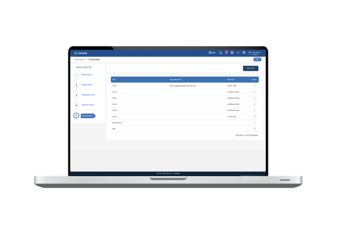
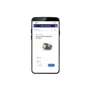
We have a brand new UI… and it’s more than just a pretty face. The first thing our clients will notice about our new release 9.0, out today, is likely the fresher colour scheme and the enhanced look and feel… promoting a more engaging customer experience.
Yes, there’s been a make-over but beauty is more than skin deep, we’ve used this major release to enhance the whole user experience in terms of flow, navigation and ease of use. And we’ve considered it from ALL our user’s perspectives.
Data Entry
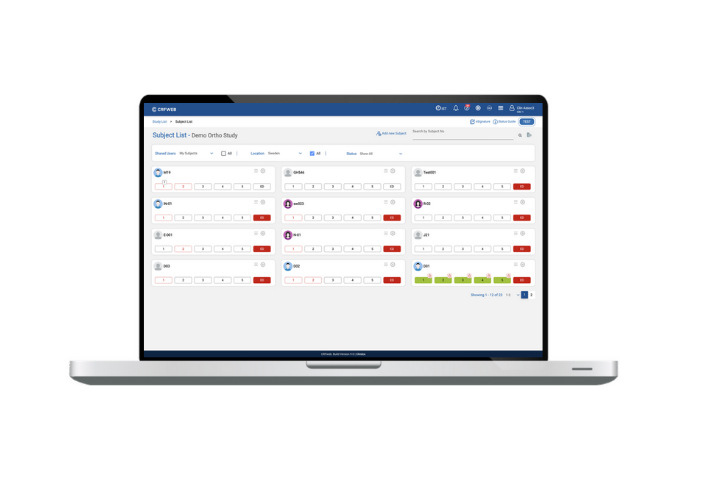
First up, data entry. We like to keep the user experience for data entry as simple and user-friendly as possible. We recognise that no matter the experience level or knowledge of our product, no-one wants to get bogged down with complicated menus, difficult navigation and fiddly data entry screens. We’ve completely re-designed our subject-listing page, to give you at-a-glance status for your subjects and simple options to pull up your subjects details.
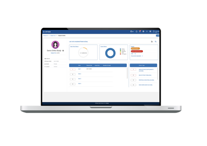
We’ve even created a dedicated page for each subject giving you all the details you need for that subject in a clear and logical layout. Whether dealing with queries or moving quickly to data entry. The steps are clear and logical.
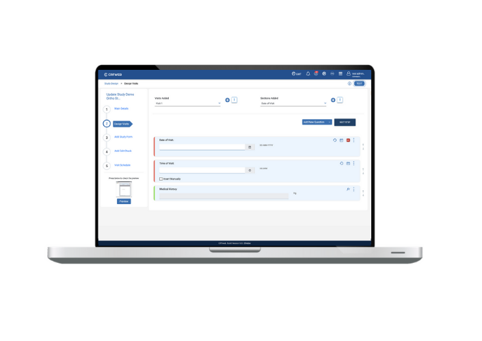
Our data entry screens have been re-designed to provide a clear and appealing format to enter subject visit information with clear and consistent keys and icons to make the next steps transparent. Whether a veteran CRFWEB user or a new recruit, you’ll appreciate our site-focussed data entry capabilities
Study Design and Build
In order to truly facilitate smooth data entry you need the appropriate study design and build tools. Numerous new features have been added to study design/build in this release – improving the simplicity and speed of design but also providing additional features, and the ability to hide others, to help streamline and simplify the data entry process.
The User can now design visits, sections and questions and get the same view as the User would in data entry mode… so ‘what you see is what you get’. Furthermore, the study builder can also perform a ‘live check’ by making data entries in date, time, grids etc. to check they’re working as expected.
Managing Data
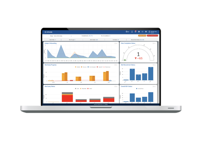
Last but definitley not least, we haven’t forgotten about the needs of those managing the studies. Numerous improvements include a visit scheduling facility and a new dashboard showcasing subject appointments, subject entry status and site status.
What we’ve learnt over the 9 years of developing and enhancing CRFWEB is that sometimes a seemingly small change to our system can have a significant time-saving for our clients. Our product is in a state of continuous improvement and this release will be followed soon with more exciting news.
If you’d like to know more about CRFWEB and see a demo of our new User Interface, please contact your local sales office.
